Role
UX/UI Designer
UX Researcher
Skills
Research Analysis
Visual Design
Protoyping
Usability Testing
Collaborators
Rohin Ebadi
Yujia Sun
Hao Ma
Duration
12 weeks
Overview
As a team of commuter students, this project aimed to tackle an issue personal to us: The negative effects commuting had on our ability to socially participate on and off campus
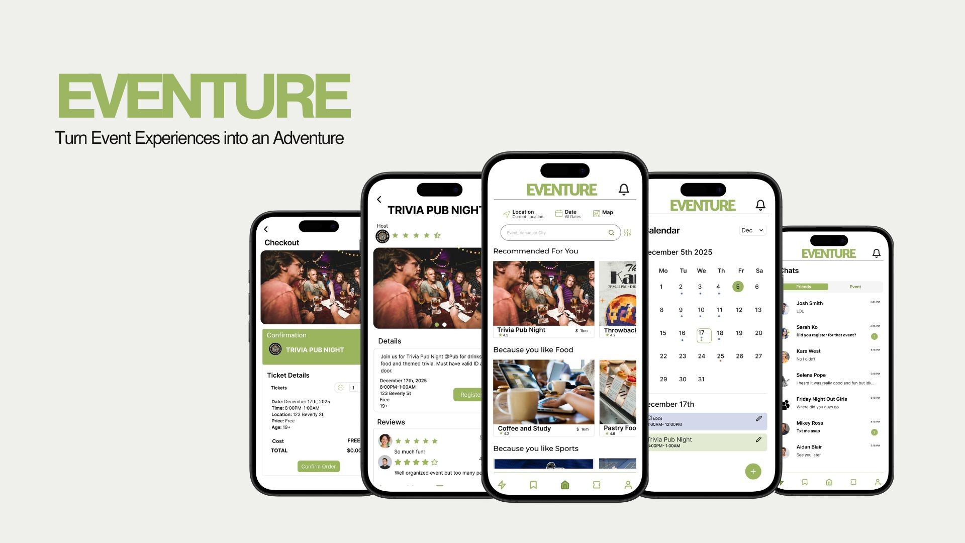
Eventure is an app that goes beyond simple event discovery. Designed to reduce the barriers associated with social participation, Eventure blends event exploration with social interactivity, making opportunities to connect more accessible, easy, and tailored to each user’s needs.
Problem Statement
Commuter students are unable to discover events and build meaningful connections, resulting in fewer accessible opportunities for social participation
Research

Commuting
De-motivates

Peers Incentivize
Participation

Digital Communities
Create Opportunity
Commuting
Limits Opportunties
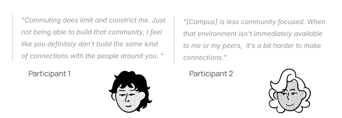
The time, distance, and location implications of commuting creates mental and physical social barriers

Commonality Creates
Community
Shared interests play a key role in helping students form stronger social communities with their peers

Discovery is
Fragmented
Fragmented event platforms make it difficult for students to identify and access social opportunities

Competitor analysis revealed a gap in the market for a platform catered to both event discovery and relationship building
Meetup
Interest-based communities
High costs and monetization of features
Strong local discovery
Eventbrite
Large database for event discovery
Minimal tools for community building
Personalized discovery tab and search tools
Thursday

Curated social event and integrated social features
Primary focus on dating
Less emphasis on shared interests or communities
Solution
A centralized database that provides accessible social opportunities to explore events and develop long-term connections
User Personas
Sean and Claire share similar goals, but Sean struggles with social-related issues while Claire struggles with location-related issues
Shy Sean
First Year Student
15 min commute
10 km commute distance
Goals
Meet new people and make new friends
Find a community that aligns with his interests
Frustrations
Doesn't like attending events alone
Has difficulties initiating conversations
Commuting Claire
Master Student
1 hr commute
25 km commute distance
Goals
Easily go out with her friends stress free
Find activities aligned with her schedule
Frustrations
Commuting impacts her social battery
Feels overwhelmed balancing social life and schedule
Ideation
Sean wants opportunities that not only align with his social preferences, but where he meet others and stay connected
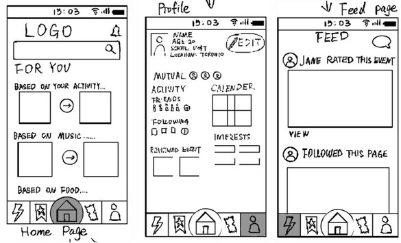
Tailored event recommendations based on user preferences
Integrated social features with direct event and friend messaging
Personalized user profiles
Find and connect with other users
Claire wants opportunities that not only align with her scheduling needs, but are reliable and easily accessible
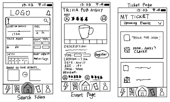
Filter search by location, distance, and personal preferences
Detailed event pages with in-depth information
Event reviews for experience reliability
In-app ticketing for convienence
Calendar tool to track events and schedules
Design Challenge
User task flow reveals social and commuter specific features were not imperative to our UI
Our user happy path revealed the task flow from event discovery to event registration were most foundational. Our design focus shifted away from features and towards creating a clear and intuitive event discovery experience
User Task Flow
User task flow reveals social and commuter specific features were not imperative to our UI
Our user happy path revealed that task flow from event discovery to event registration and ticketing were most foundational. Our design focus shifted away from features and towards creating a clear and intuitive event discovery experience
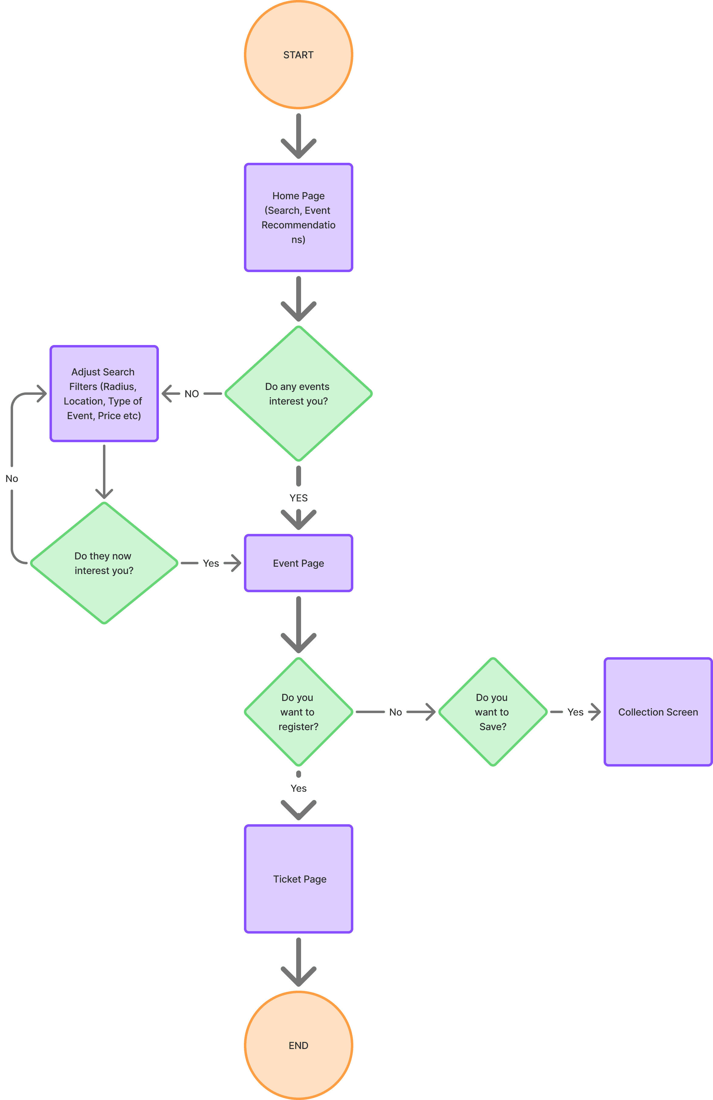
New Design Focus
Event listings and pages
Event registration and ticketing
Messaging feature
Calendar feature
Social Feed
Wireframing & Prototyping
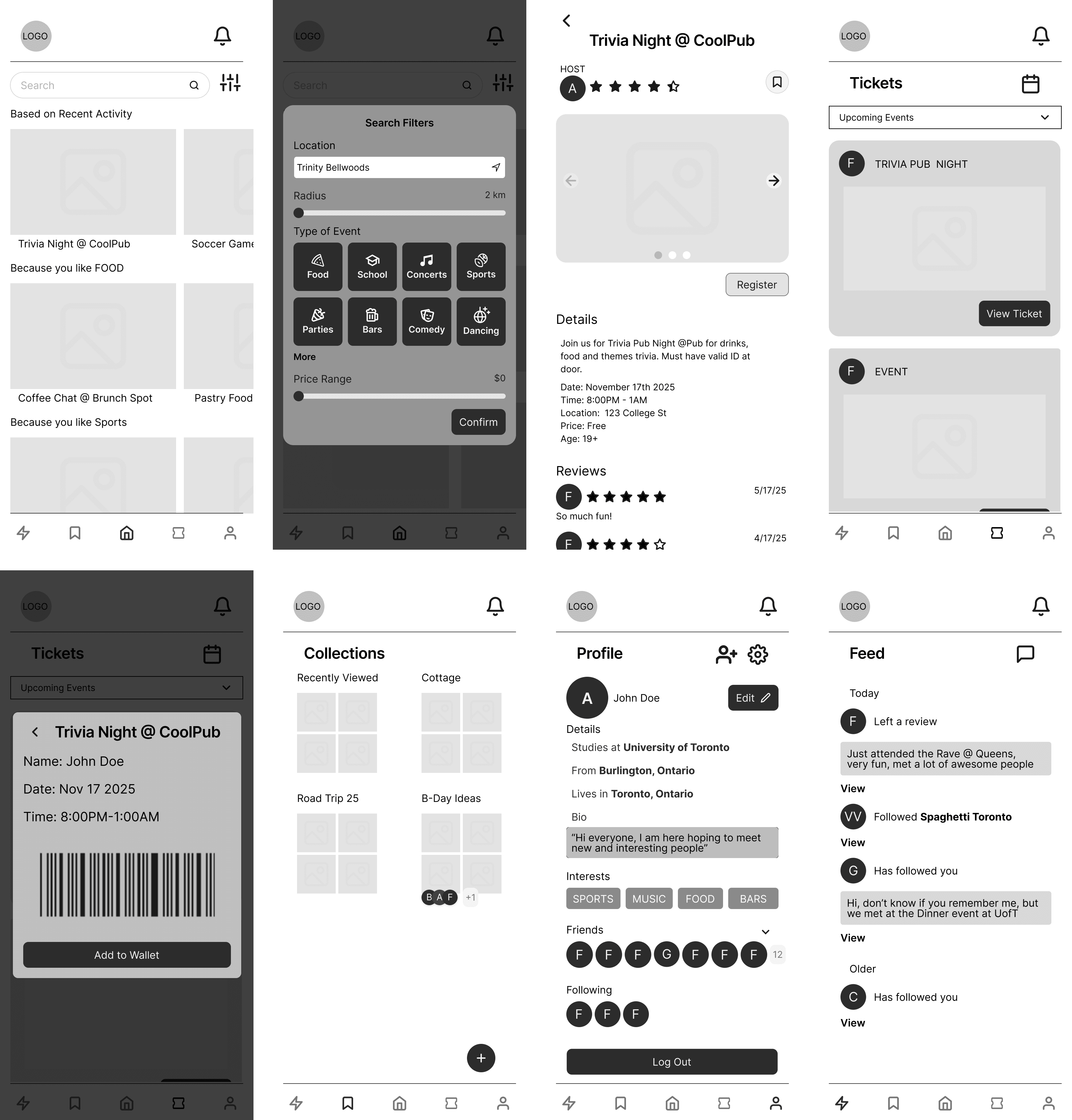
Transforming ideas into a final medium fidelity wireframe
After collecting insights, identifying pain points, ideating solutions and finalizing task flows, we created a medium fidelity wireframe and prototype
User Task Flow
User task flow reveals social and commuter specific features were not imperative to our UI
Our user happy path revealed that task flow from event discovery to event registration and ticketing were most foundational. Our design focus shifted away from features and towards creating a clear and intuitive event discovery experience
Usability Testing & Revisions
While UI was considered intuitive, the lack of attention to features was the downfall
I conducted and assisted in four out of eight usability tests where users were tasked to find and register for an event based on simulated user preferences. The results revealed the features initially scaled back on were more foundational than originally thought
Search tools were the natural start points for users
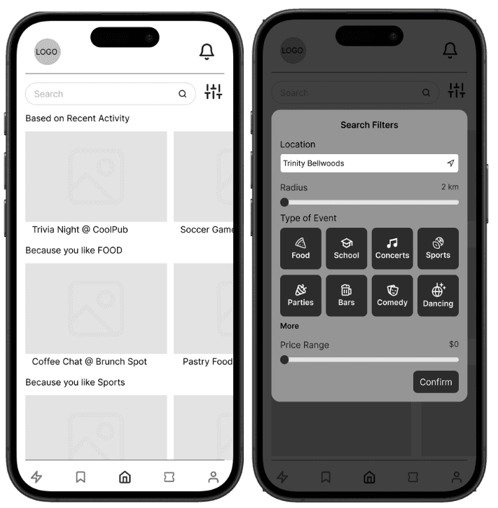
Four users' first instinct were to use the search filters before manually scrolling through event listings, with one user highlighting how event listings lacked emphasis. Lack of focus on search showcased a key area for design improvement
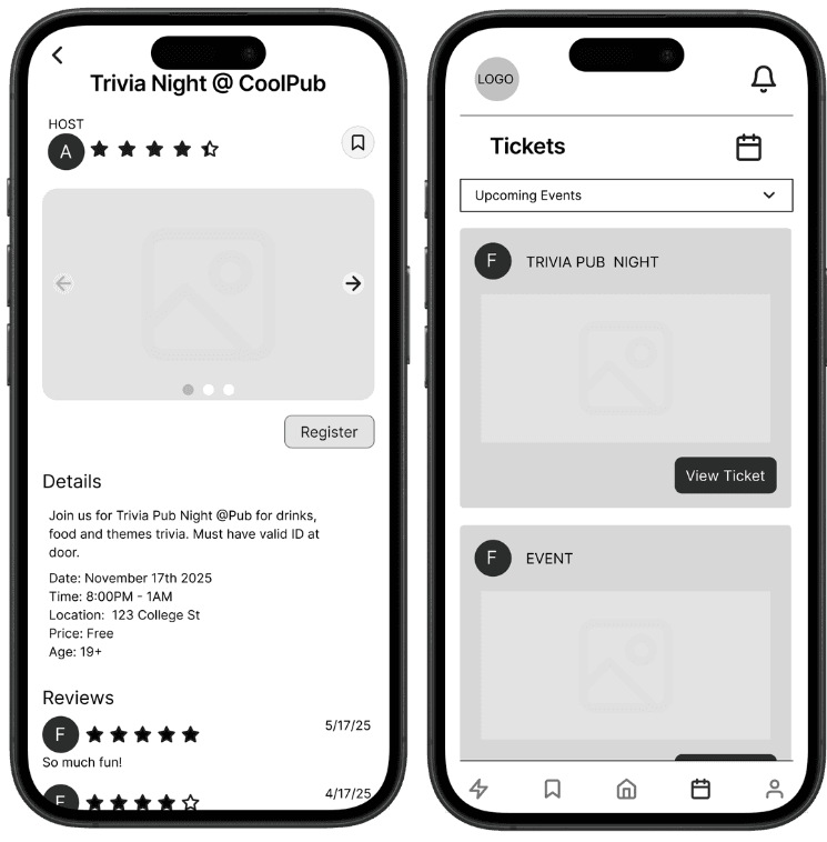
Original
Event listings lacked detail and text differentiation
Lack of event details and header differentiation
Filter options lack hierarchy and organization
Filters do not accommodate a large range of factors
Revised
Event listings lacked detail and text differentiation
Detailed event listings with visible information
Relocated location and date filters above search with the addition of a map tool
Personalize search further with time, event type, and price based preference filters
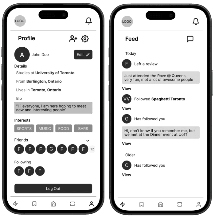
Missing confirmation feedback caused user uncertainty during task flow
Four users needed clarification on whether event registration was confirmed before proceeding to the next task step. The absence of registration confirmation created uncertainty and heavily disrupted user task flow
Original
Event listings lacked detail and text differentiation
Lack of clear CTA's
No registration overview or confirmation step between registration and recieving ticket
Revised
Event listings lacked detail and text differentiation
Emphasized CTA buttons
Implemented Checkout page for clarity
Replaced upcoming and past event dropdown with interactive toggle
Enhanced ticket display with more detail and QR code
The platform's social interaction capabilities were not effectively conveyed, leaving users confused
Although social interactivity was not part of this test’s task flow, three users independently asked about these features. One user expressed interest in the Profile and Feed page but felt the screen design lacked clarity, while another noted they overlooked the chat feature
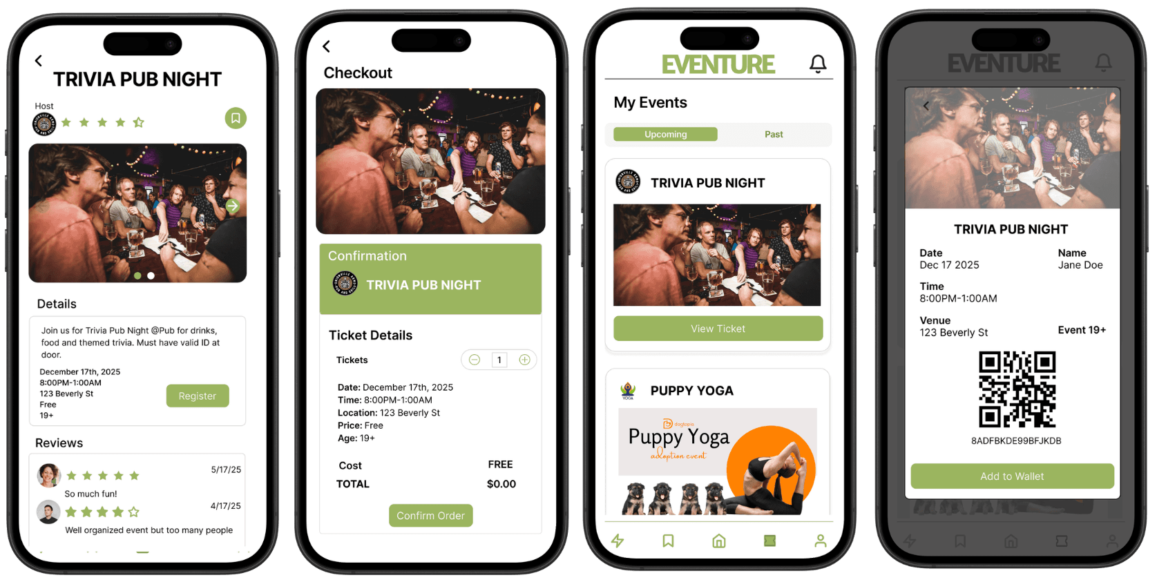
Original
Event listings lacked detail and text differentiation
Cluttered and disorganized screen design
No prominence to social features
Lack of interactivity and function clarity
Revised
Event listings lacked detail and text differentiation
Redesigned screen layouts
Implemented interactive messaging feature to showcase chat feature
Implemented additional calendar tool for tracking
Final Design
Eventure is a user-centered platform that goes beyond the limitations of commuting, providing accessible social experiences tailored to individual needs and preferences
While Eventure cannot eliminate commute limitations, it is designed to help alleviate the stress that commuting has on social participation, ensuring meaningful connections are fostered no matter the physical or mental barriers
Discover, Register, Attend
Browse curated event listings, register and manage your tickets all in one centralization platform
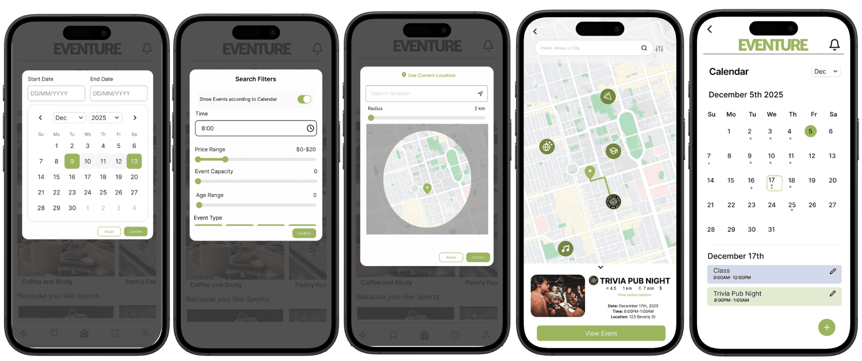
Customize platform experience based on specific needs
Customize search results based on user location, scheduling and social preferences creating accessible opportunities. The addition of a calendar tool allows for users to easily keep track of upcoming events alongside their pre-existing schedules
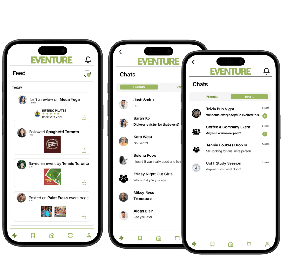
Stay connected before and after events
Automatically connect and stay connected with friends and other event attendees through direct messaging, including event and individual group chats.
Takeaways
Here are the key takeaways I learned through this project
Functionality First
Designing for a specific user group made me too focused user-specific features and I lost sight on the core user issues I was solving for. Now, I understand that building a foundational UI that can cater to my user group and beyond is just as effective.
Less is More
I spent too much time going back and forth on ideas during the ideation stage, resulting in less time to wireframe and work on making prototype more interactive before usability testing.